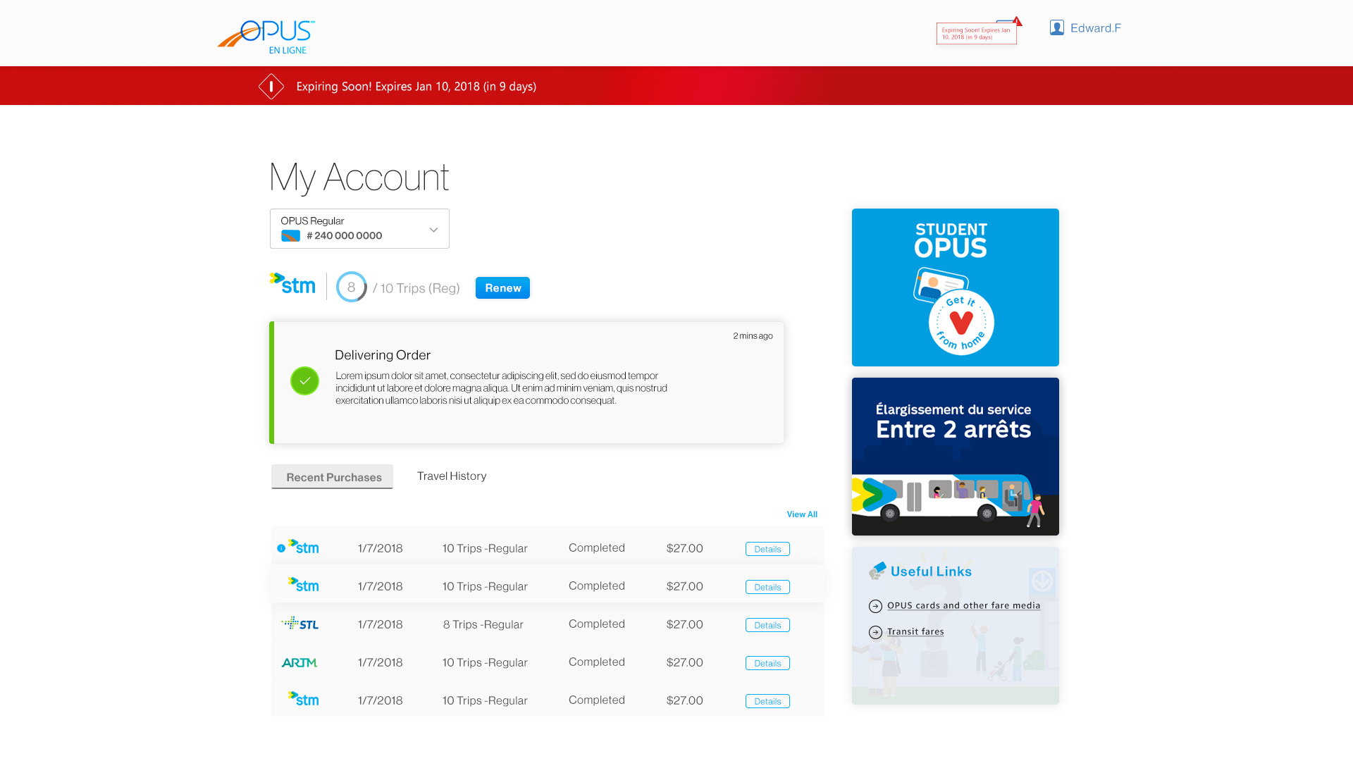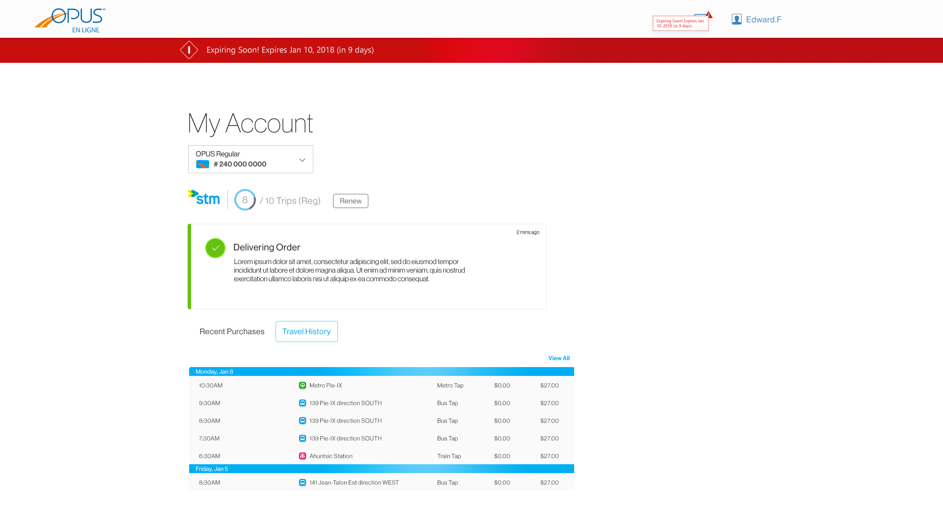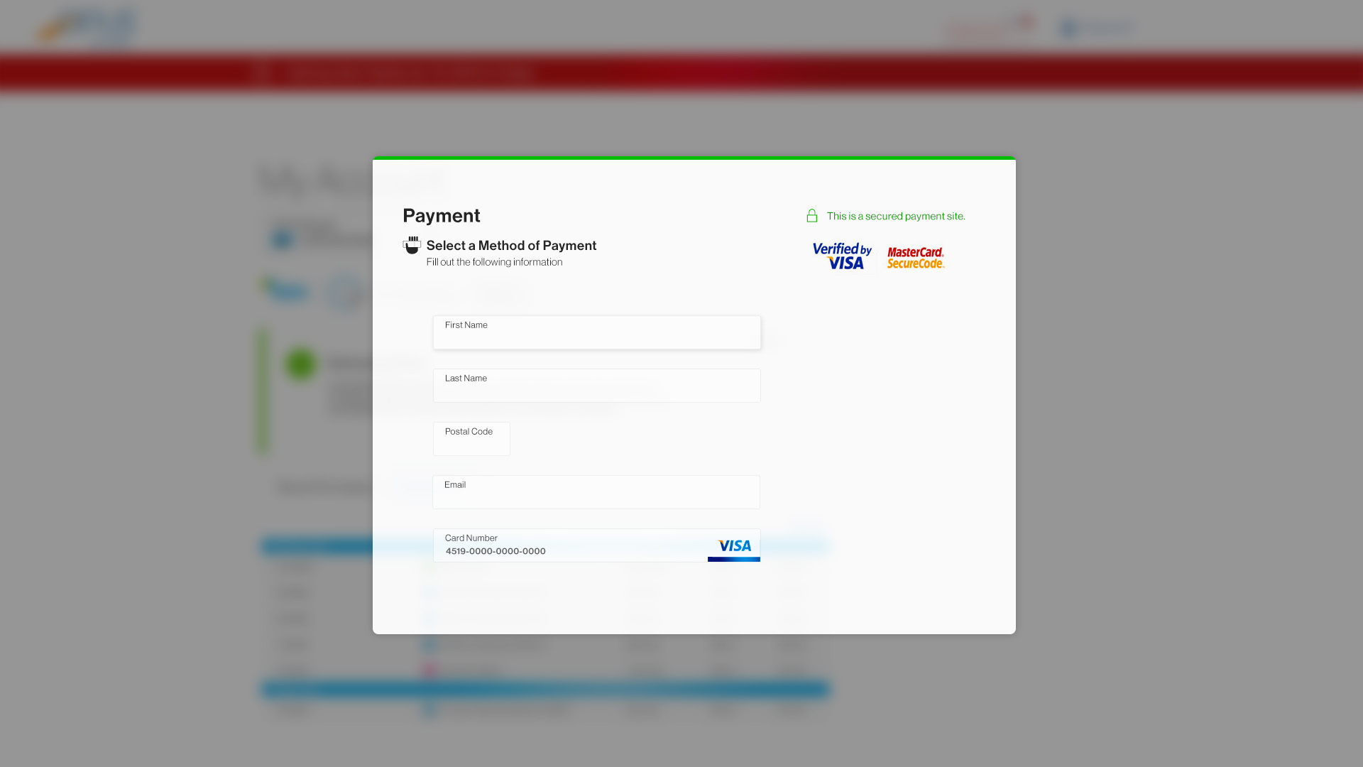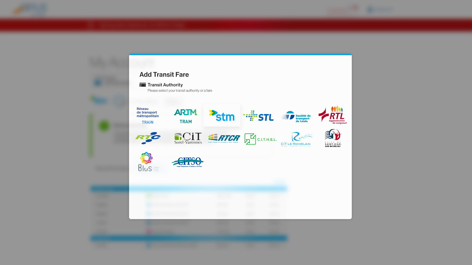
As a public transport user, one of my biggest frustrations was having to line up at the Metro station or at a store to top up my Opus card. When the STM launched their online service, it launched with so many issues. In order to charge your card, you have to:
– Buy a special device
– Connect such special device and download Net Framework, Java and other MS libraries
– Connect this device and grant permission while it checks your card online
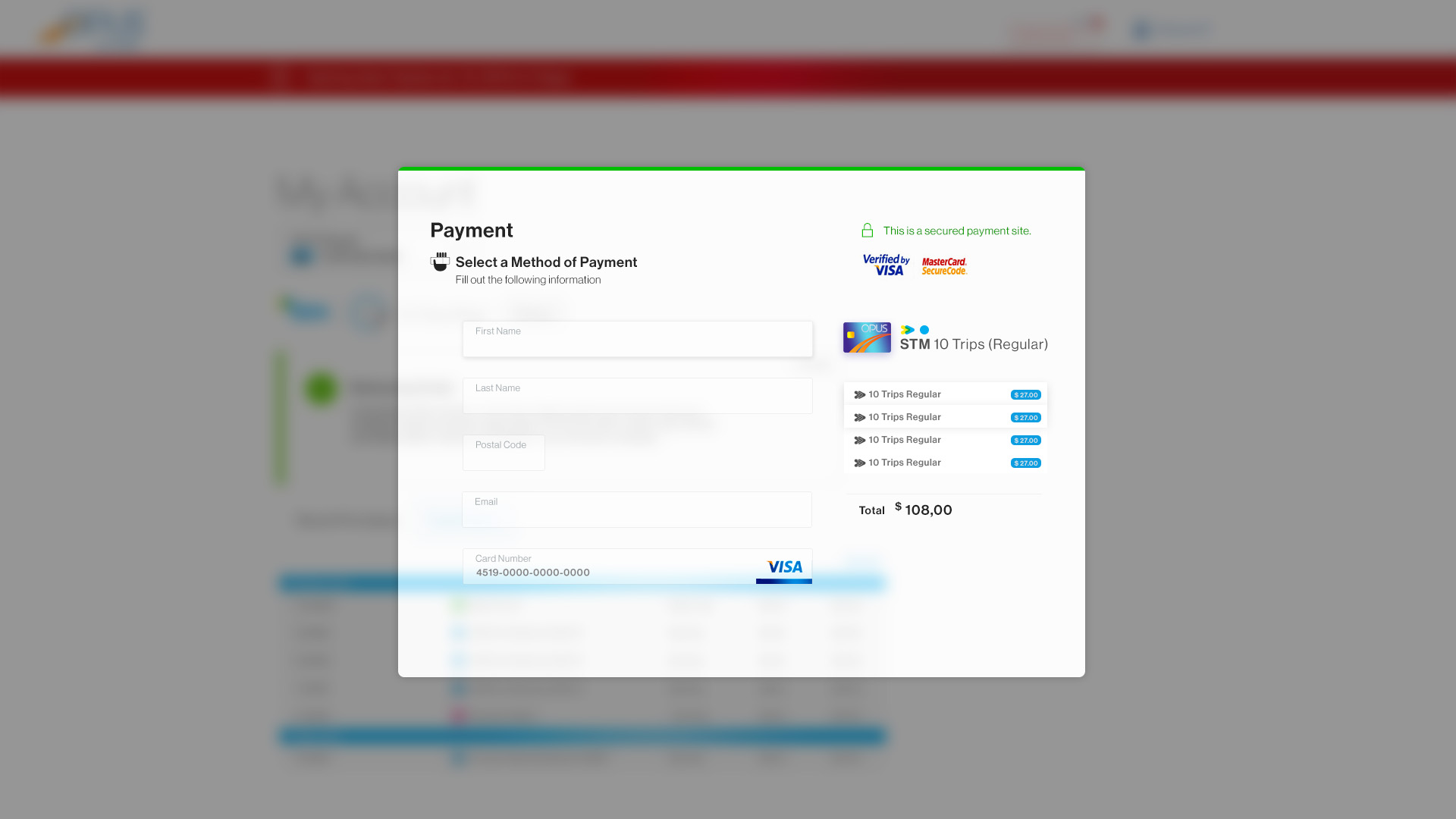
This process never worked correctly, it often crashed or failed to scan the card. So, one day I started brainstorming ideas and came up with these concepts. The main focus was to make it easier to top up a card, something that shouldn’t take more than five minutes.
In the coming weeks I will post a blog post braking through my ideas on how the STM could benefit from making a unique system ID for each of their cards.
With such system in place, it will open a door to endless possibilities on the web and mobile. Making the experience accessible to everyone.